
CASE STUDY:
LUNA Series:
Death of the Can Light
-
Liteline is one of Canada’s largest lighting manufacturers, specializing in providing industry leading solutions that light up architectural, commercial, industrial, and residential spaces.
For decades, they have provided the electrical industry with innovative, no-compromise lighting solutions that help inspire and bring life to the places that we live, work, and play in.
With so many options in the lighting market being restrictive with spatial requirements and/or complicated installations, Liteline’s solves these issues with simplicity by killing the can light.
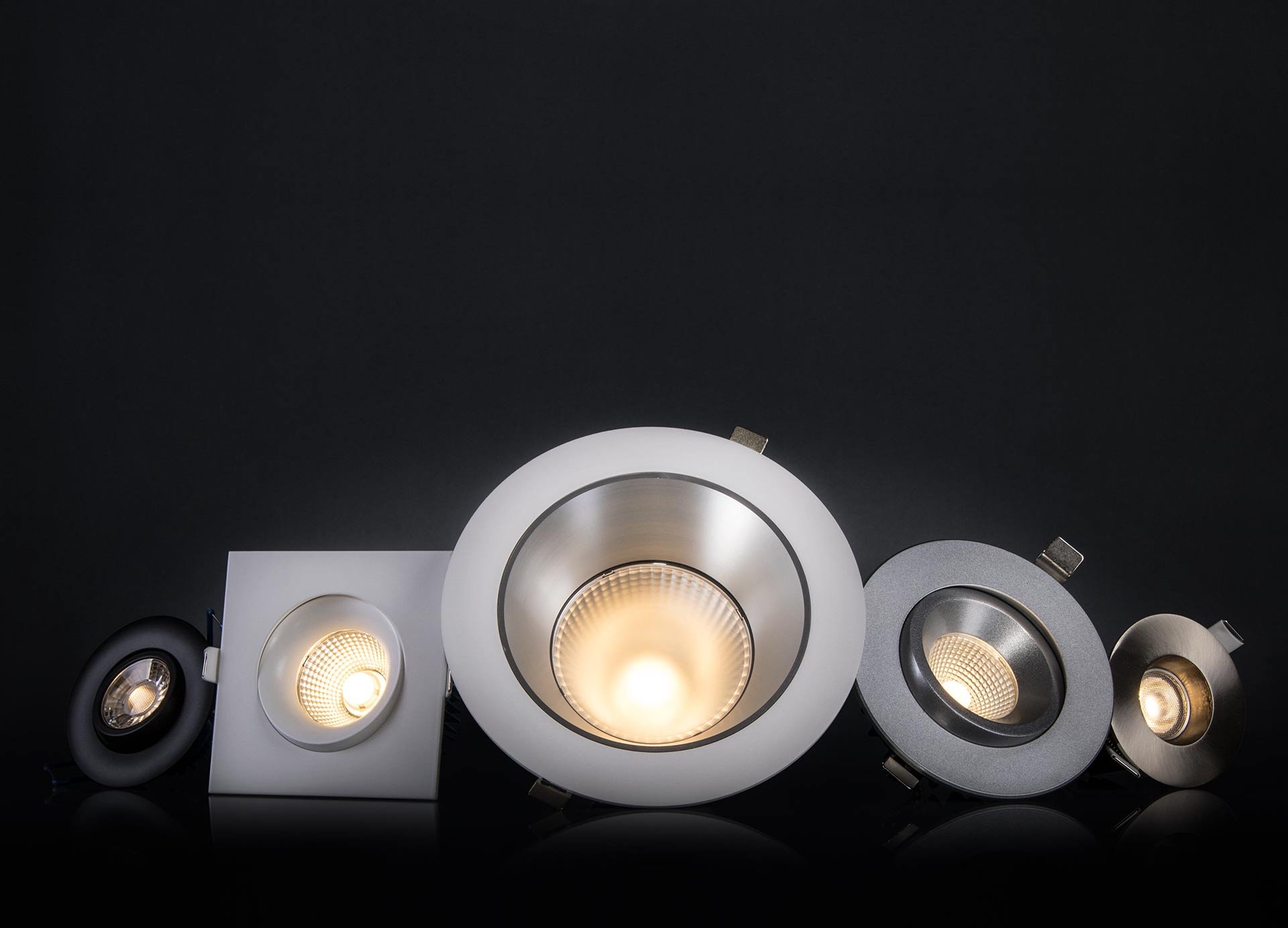
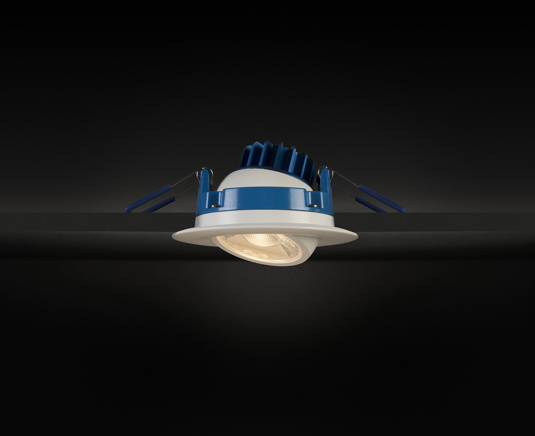
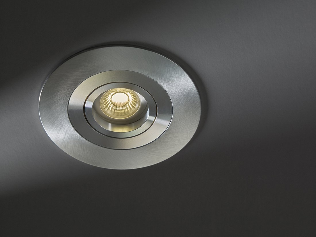
Death of the Can Light - the LUNA series offers the housing, trim, and lamp look, without the overhead and heat.
CHALLENGE
Make the LUNA series shine bright to match the high touch feel of this well polished fixture and increase the visibility of the LUNA brand.
OUTCOME
Became one of the company’s best selling fixture, making it a staple in the product line-up. Increased brand positioning on recessed lighting products with brand new marketing materials. The popular “Death Box” promotional package became a smash hit with the sales agents and specifiers.
SCOPE OF PROJECT
Marketing Strategy
Art Direction
Graphic Design
Digital & Printed Marketing Assets
Product Launch
Channel Marketing
Marketing Strategy
Being a lighting manufacturer, the LUNA series marketing strategy was focused on appealing to the ever-changing needs of Architects, Engineers, Interior Designers, property developers and our Distributor Partners' project designs.
The main selling point of the LUNA series is that it offers the housing, trim, and lamp look, without the overhead and heat. We wanted to highlight the concept that the product does not require the traditional “can” that is housed above the ceiling - making easy to install, service, and fit into any existing space.

Smashplate design allows for easy mounting and servicing, without the hassle of the can.
The lack of a canned housing along with a sleek and minimal design made the LUNA series a perfect choice for most lighting projects, targeting 3 specific segments of the lighting market:
New construction
Retrofit
Re-model installs

With key selling features on all panels - the Death Box was a popular travelling sales tool used by agents and distributors.
Death of the Can Light
Death of the Can Light was used as the main tagline for LUNA series marketing campaign. The bold statement of killing off the can was meant to highlight the impact of the brand’s product innovation. The concept revolves around the balance of light and dark, black and white, life and death.
In our case, we embrace death - the death of outdated lighting practices along with all of it’s troubles and inconveniences. By killing the can light, the LUNA series celebrates a transition towards more effective modern lighting solutions.


Art Direction
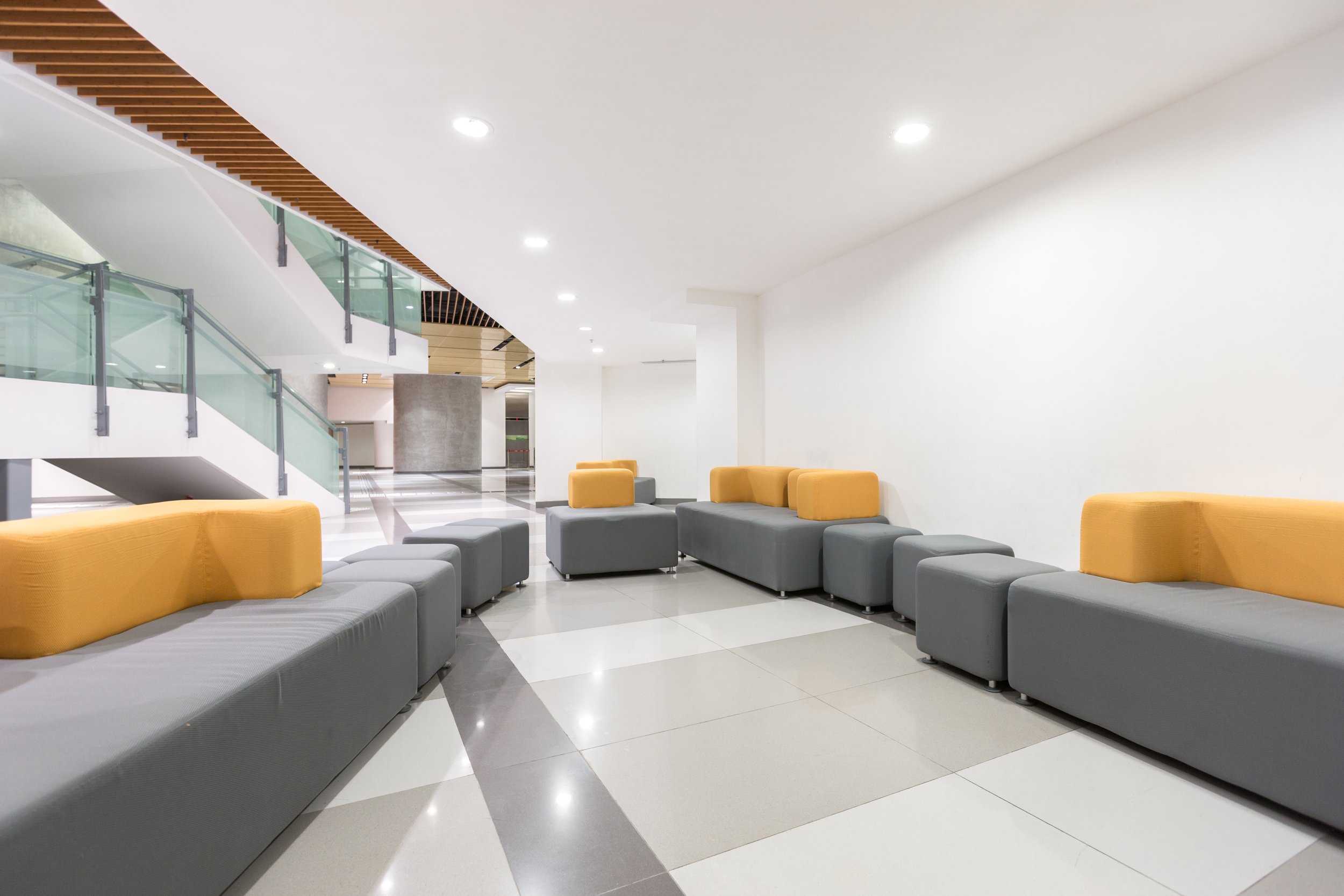
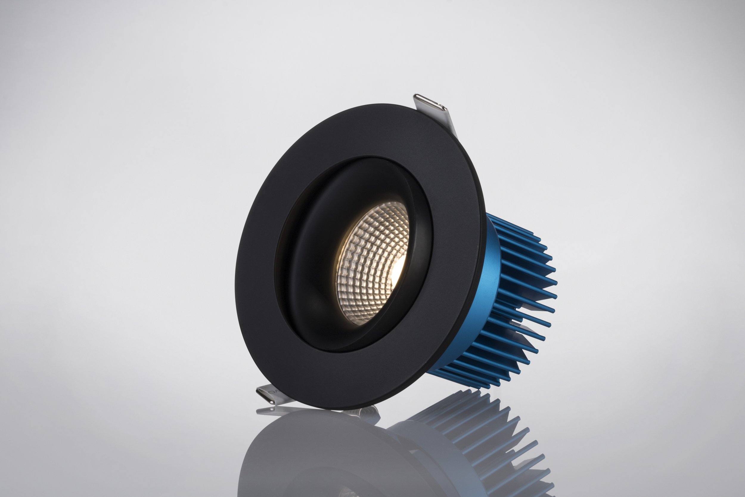
For LUNA product’s visual assets, we worked with both in-house and external photographers to produce the images used for our campaigns. The imagery used focuses on showing how our product can brighten up the spaces people interact with on a regular basis while showing the capabilities of the product.
Narrowing the artistic direction to 2 styles, we wanted the consumers to feel a sense of familiarity with the spaces we live, work, and play in. The shots used for the campaigns comprises of:
Hero product shots: highly detailed glamour shots
Lifestyle spaces: familiar everyday spaces

LUNA series product feature video.
Graphic Design
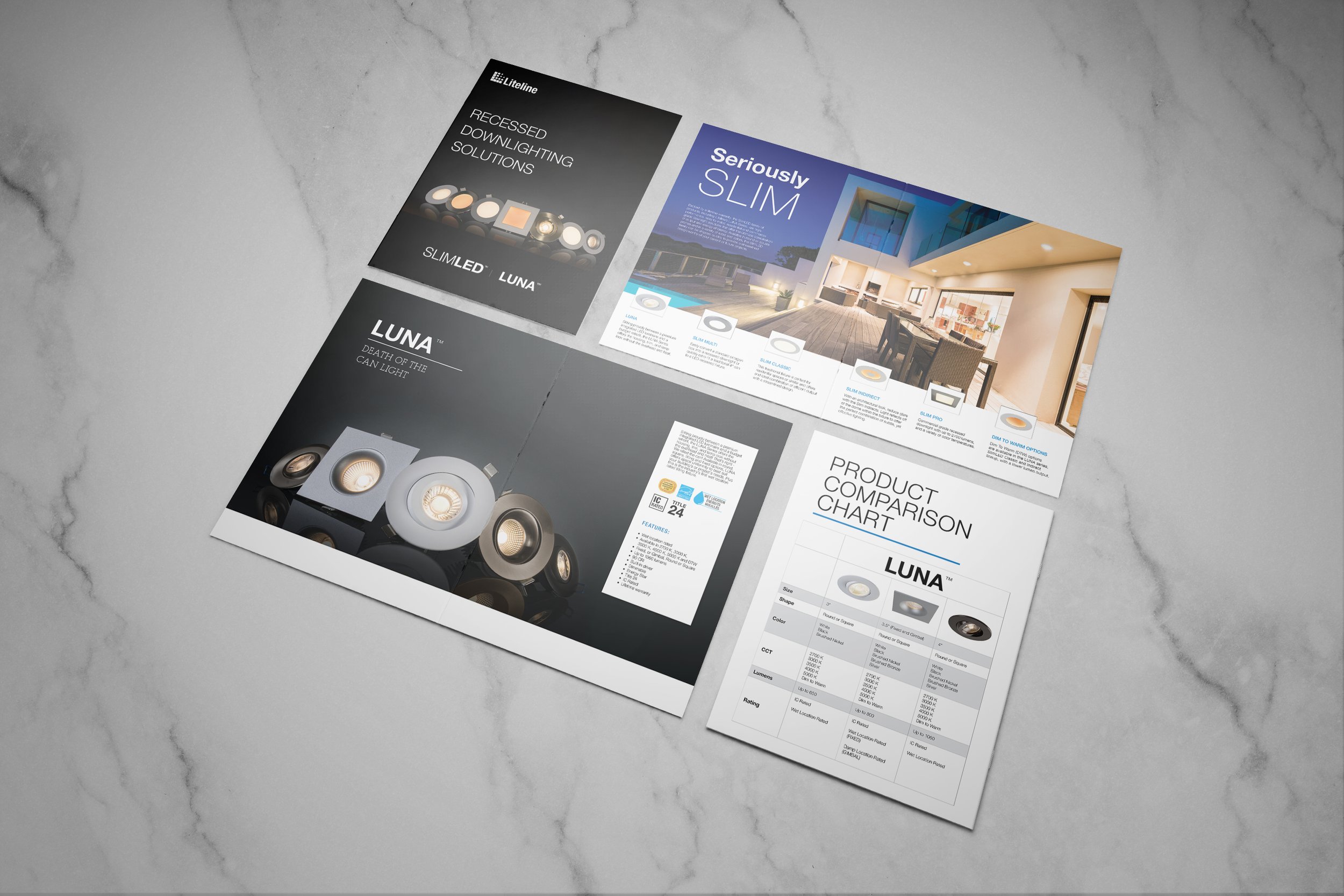
The digital and printed assets were the foundation of the LUNA series marketing strategy. The brochures and sell sheets made were used by our agents and distributors for sales and training. One of the main focuses of the designs was to be able to easily and quickly find the key information needed to spec-out a lighting project.
Working with the engineering team and our agents, we determined that size, lumen output, and colour temperature were the primary features that our consumers look for when choosing a product for a job. Whenever possible, we used icons to represent information that could be important to consider. Visibility, contrast, bold typography, and negative space was balanced to give hierarchy to key features with enough breathing room for necessary information to stand out.


Results & Outcome
The LUNA series product launch turned out to be a huge success, becoming a staple in the product line up. “Death of the Can Light” was widely accepted by consumers with a warm reception. Our consumers resonated with the brand message and story telling portrayed by our Death Box marketing campaign with sales figures to back it up.
One of the greatest moments was hearing agents and distributors call in to order supporting materials - “Hey can we get some more of those Death Boxes?”… It’s just has such a badass ring to it, am I right?
Let’s build something beautiful.
It all begins with an idea. Whatever it is, the way you tell your story can make all the difference.